Case Study, 2022
Chocolat Uzma
Introduction | Problem & Process | Understand | Ideate & Validate | What We Found | What It Means | What I Learned
-
Introduction
-
What is Chocolat Uzma?
Chocolat Uzma is a woman-owned chocolate and confection store located in Chicago, Illinois. They have a physical location and website. Their products range from chocolate bars and truffles to baked goods and seasonal treats like ice cream. They also have corporate gift options and an in-store cafe.
-
Why choose Chocolat Uzma?
My goal for this project was to redesign the Chocolat Uzma website content and checkout process to make online shopping easier for customers.
-
My Role
Sole researcher and designer
-
My Responsibilities
Made a content inventory to review site information and establish scope of project
Developed user personas to understand motivations of site usage and user priorities
Recruited participants for multiple rounds of user testing
Conducted two rounds of remote card sorting to make informed decisions when labeling site content
Conducted two rounds of remote IA testing to make informed decisions when organizing site content
Created wireframes for two rounds of task-based first click usability testing to observe user decisions when interacting with site
Identified findings from research and provided design implications

Problem & Process
Chocolat Uzma's site had products that were hard to find and a checkout process that was difficult for customers to use. How could this site be designed to increase successful e-commerce sales?
-
Understand
What content should we focus on?
Who uses Chocolat Uzma?
What features do customers use the most? -
Ideate & Validate
How did we gather data?
What did our participants share with us? -
What We Found
What findings did our testing unveil?
-
What it Means
What changes will benefit customers? What did I learn as a UX researcher & designer?
Understand
After identifying major content, I wanted to understand customers and their priorities.
-
Chicago, IL
A data analyst that works from home, Michelle follows a vegan diet and loves sweets. She wants to support a local business in her area, but sometimes finds it difficult to find local, high quality vegan chocolates. Michelle goes to chocolat-uzma.com and discovers the different types of dairy free items that she is able to order from the convenience of her own home. She is able to ship these to her home or pick these items up later in the store while she is running her errands.
Who shops at Chocolat Uzma?
User Personas & Journeys
-
Chicago, IL
A journalist who is married with a family, David knows Mother’s Day is coming up, and he wants to buy his partner some truffles and a batch of chocolate chip cookies that she loves from one of her favorite chocolate shops, Chocolat Uzma. While visiting the chocolat-uzma.com website, David is able to select the quantity of chocolate chip cookies as well as add a box of mother’s day truffles to his shopping cart. He checks out and selects the day that he would like to pick up his goods on the following Thursday. When Thursday arrives, David heads over to the Chocolat Uzma shop to pick up his carefully prepared and chosen gifts.

Ideate & Validate
I conducted multiple rounds of testing to prepare for our design. We conducted first-click testing with low and high fidelity wireframes.
Card Sorting
The first round (open card sort) established 3 major categories based on user placement rates.
In the second round (closed card sort), all cards except for one were sorted into categories with at least an 82% agreement rate between users.
Findings from these 2 rounds led to a proposed sitemap for the next type of evaluation by sorting webpages into the navigation menu categories (based on where users placed them most frequently during testing).
Information Architecture (IA) Testing
I conducted one round of IA testing to test our sitemap
The IA tree jack testing had 4 navigation menu tasks that covered the following objectives:
Finding a gift card under “Gifts”
Finding truffles or bonbons under “Chocolates”
Finding shipping details under “About”
Finding ice cream under “Bakery & Sweets”
3 tasks had at least 89% finding success rates, 1 had a 78% success rate. In the post-interview, we found that lack of user attention affected this score
This informed the initial sketches for our low fidelity mobile wireframes
Next Steps: Designing for First Click Testing
During a meeting with the owner and social media team, we decided on two main task flows to focus on for remote first-click testing.
I designed low-fidelity wireframes for the first round of testing to evaluate the e-commerce process of Chocolat-Uzma.com.
-
Overview
Recruited 30 participants using Chocolat Uzma’s instagram platform
Evaluation included 10 task-based scenarios and survey for users to complete
-
Task flow 1: Shopping
-
Task flow 2: Check out
-
Findings
7 out of 10 tasks had a success rate of 83% and above
User feedback from survey pinpointed obstacles in the first round of testing
Next, I created high-fidelity wireframes to validate findings from the first round.
I also redesigned the wireframes of the unsuccessful tasks.
-
1
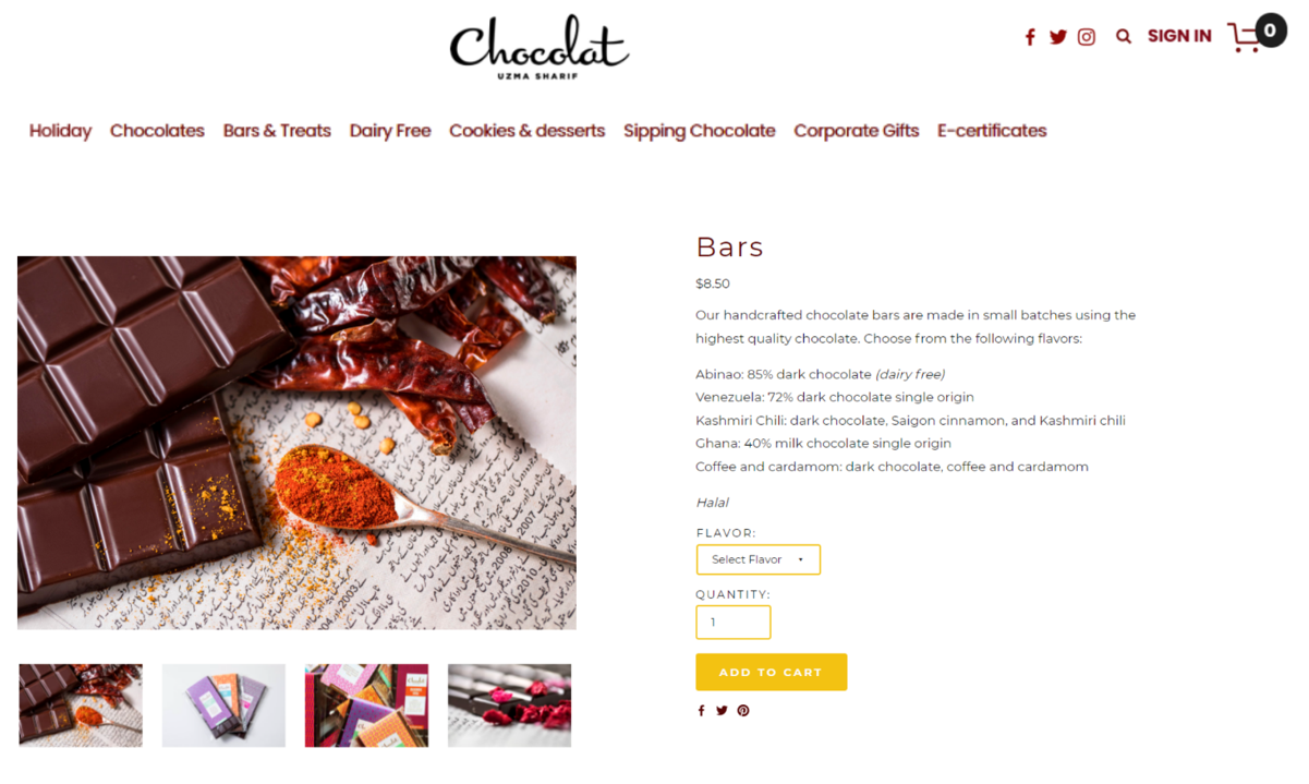
Select Item Type
-
2
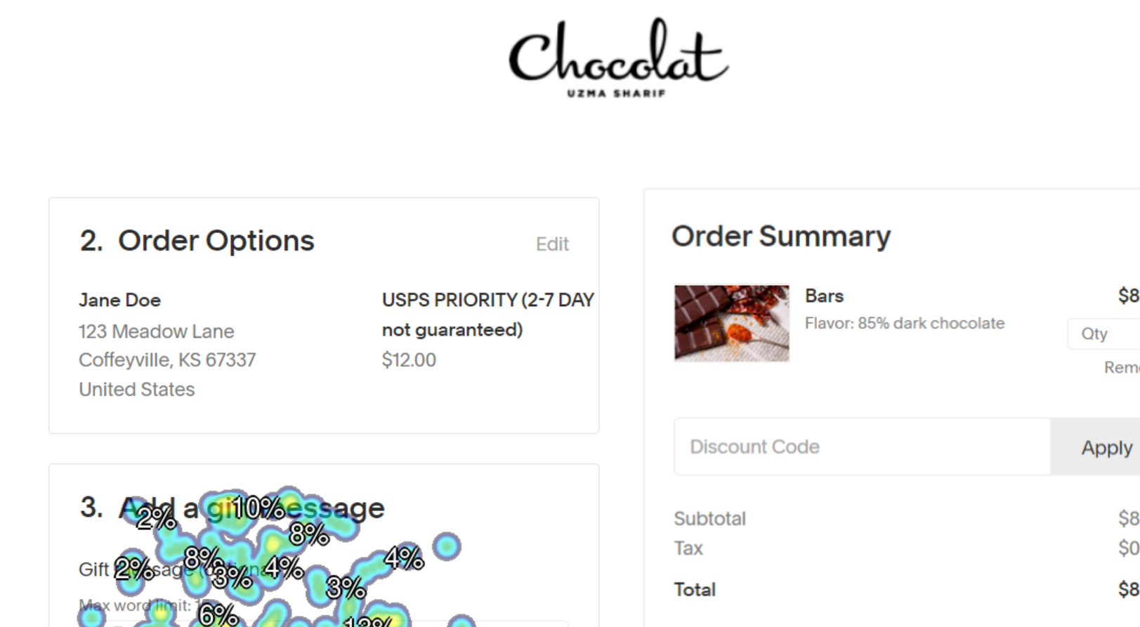
Checkout Process- Shipping
-
3
Checkout Process- Add Gift Message
What We Found
First-click testing identified implications for our final design.
Design Implications
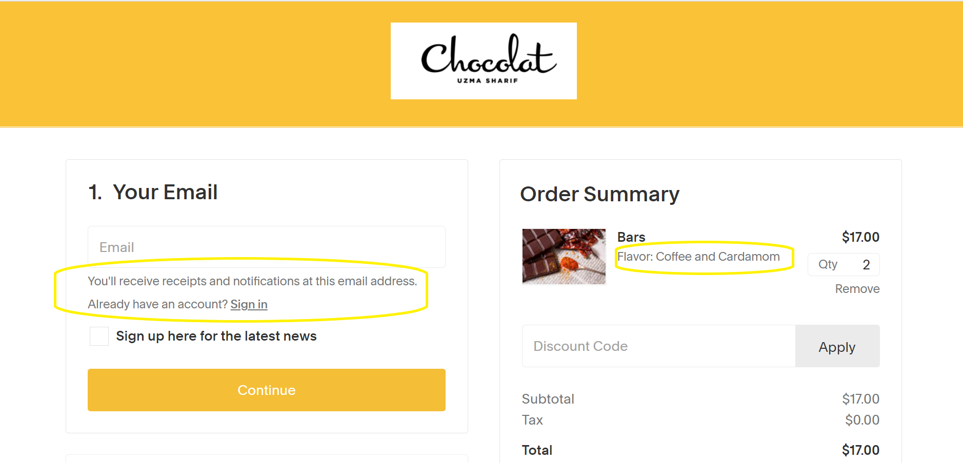
1. Reducing steps in the checkout process and designing with familiar components will reduce user confusion and increase online sales.
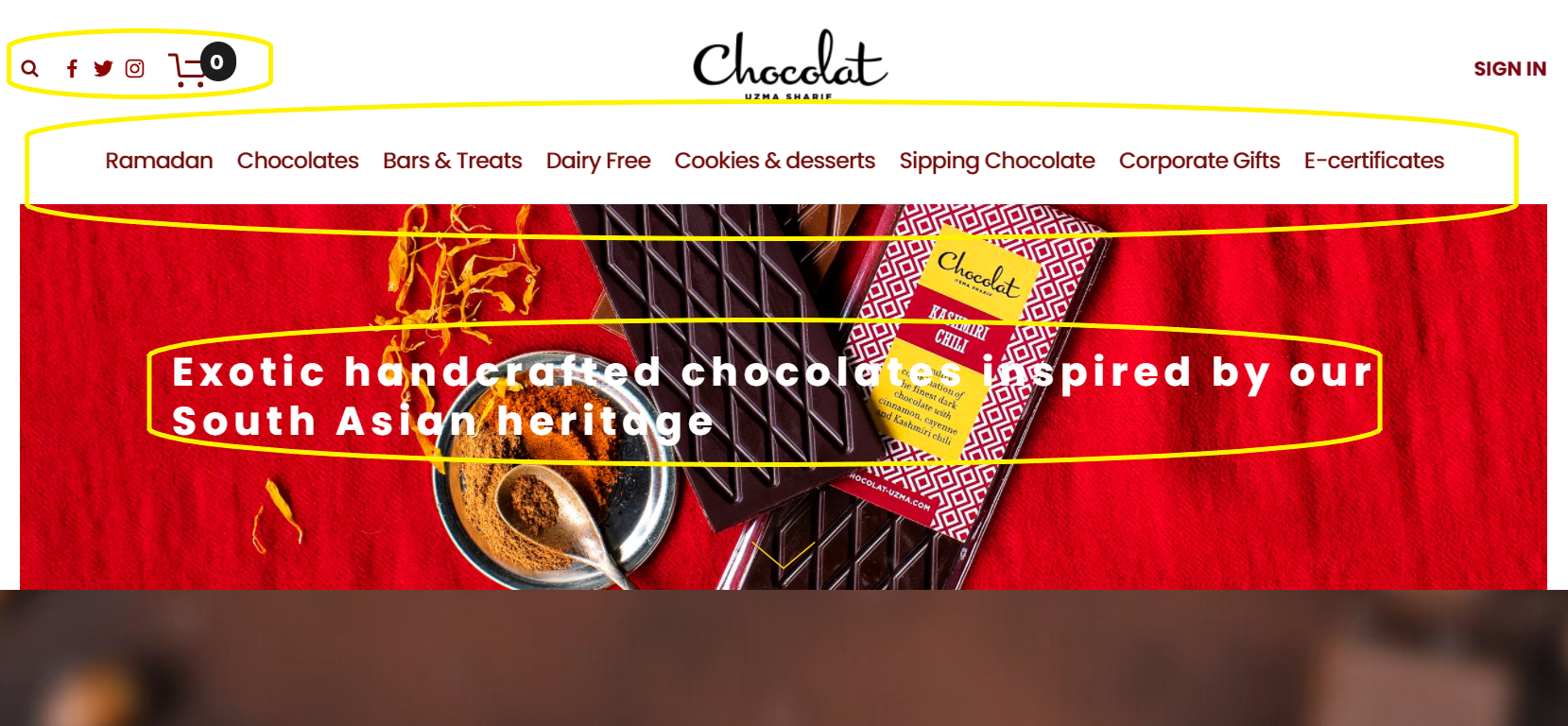
2. Minimizing extra text will help users with scanning and selection without confusion
3. Clear and concise text and clickable buttons help users accurately choose decisions

What It Means
How to make the checkout process easier for Chocolat Uzma
What I learned
-
Prioritize research
Don’t try to hit the users with all of the tasks at once- spread them out and prioritize what is important. This reduces decision fatigue and increases accuracy.
-
Open up the floor
Recruiting can be time-consuming and difficult. Have a list of tried-and-true incentive options that you can talk about with stakeholders to get the ball rolling.
-
Take the reins
Take creative control and communicate macro-level findings to busy stakeholders before moving on to next steps.


