Case Study, 2021
Instacart
-
What is Instacart?
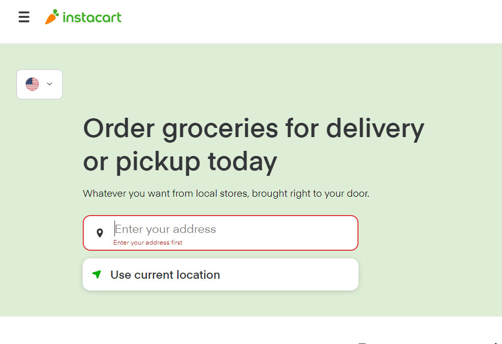
Instacart operates a grocery delivery and pick-up service. This application allows customers to order groceries and other household items via its mobile app and website to get delivered to their homes by shoppers.
-
Why did we choose Instacart?
Instacart is one of the most widely available grocery delivery apps across the United States. This service claims to offer convenience and efficiency for all users, including individuals that are blind. We wanted to to test the accessibility of the Instacart website for individuals that were visually impaired.
-
The Team
Shelby Rhodes | Justin Millan | Best Phakamad | Clifton Tipon
All collaborators with research and test moderating as master's candidates at DePaul University, Chicago, IL -
Roles & Responsibilities
Conducted preliminary research, compiling a literature review
Created a task-based usability test to identify key pain points
Recruited participants for user testing
Moderated usability testing and user interviews
Identified themes from research and established accessibility recommendations

Problem & Process
Users who were visually impaired had difficulty navigating the Instacart website. Why was this delivery app more difficult to navigate than others?
-

Preparation
What Instacart features do customers use the most? How can we develop a strong study?
-

Learning & Listening
What did we notice during the task-based evaluations? What did our participants share with us?
-

What We Found
What themes did our testing unveil?
-

What it Means
What changes will benefit customers? What did we learn as UX researchers and designers?

Preparation
Our team developed a task-based usability test using the Instacart website. We focused on the checkout task flow.
-
1
Login
-
2
Add to Cart
-
3
Checkout

Between Subjects Design
4 visually impaired users
5 sighted users
Procedure
Moderated remote testing and interviews over Zoom video call
Assessment Research
We wanted to dive into their Instacart experience. What worked? What didn’t?
Collect & Analyze
Compiled timed task data, notes, and recordings from testing
Reviewed interview transcripts to identify themes
Learning & Listening
Users with visual impairments faced major design obstacles that sighted users did not encounter.
Task Completion Time
Our sighted participants all completed all of the three tasks in under 5 minutes. Visually impaired participants task completion times ranged from 13 to 32 minutes.
Users with Visual Impairments: Task Experience Ratings
None of the users with visual impairments rated any of the tasks as “easy”. Sighted users rated the majority of their tasks as “easy” or “moderately easy”.
Sighted Users: Task Experience Ratings
Visually impaired users said:
“[Screen content is] not accessible to the commands that I know so everything I'm trying isn’t working.”
— Jane
“There's no [order] confirmation announced so you have to go hunting all over just to find out what a usual sighted person would see.
— Larry
“I would have liked to see each result start with a heading, those are what the best search pages are and something we blind people expect.”
— Layla
What We Found
Our team identified five themes from our research.

What It Means
Let's make an easier Instacart experience.
Design recommendations
-
Within code, label images with accurate and descriptive alternative tags
Restructure headers and labels in code so assistive screen reader technologies can navigate the webpage easily
Show priority items first in the search results
Provide bypass blocks in sections that have repetitive content
-
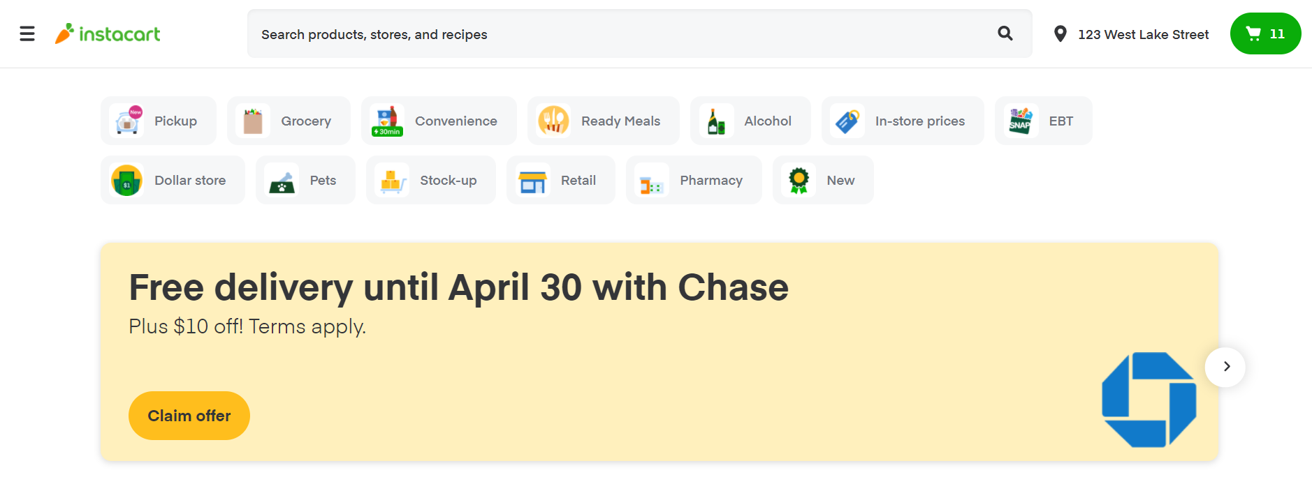
Give option to skip over any extra shortcut menus on the homepage to simplify layout
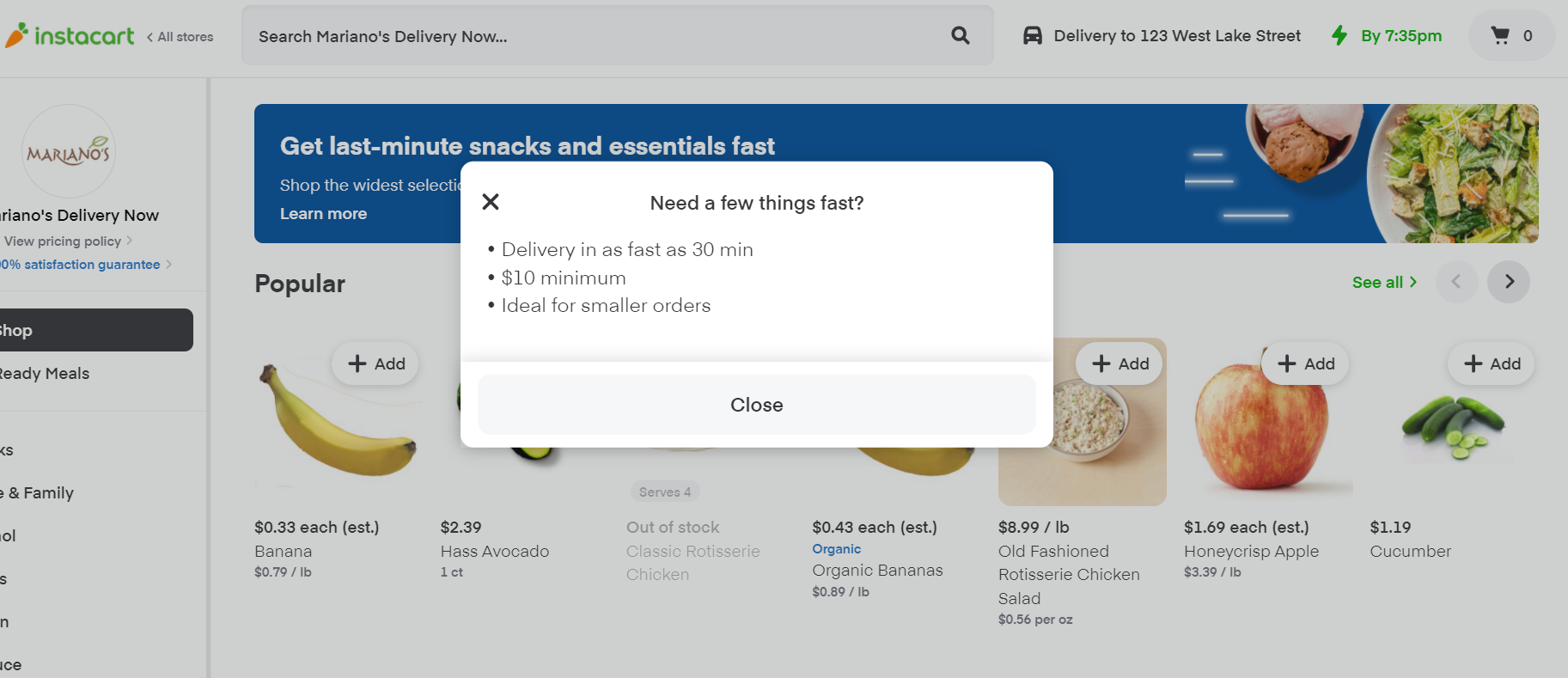
Reduce the number of suggested items
-
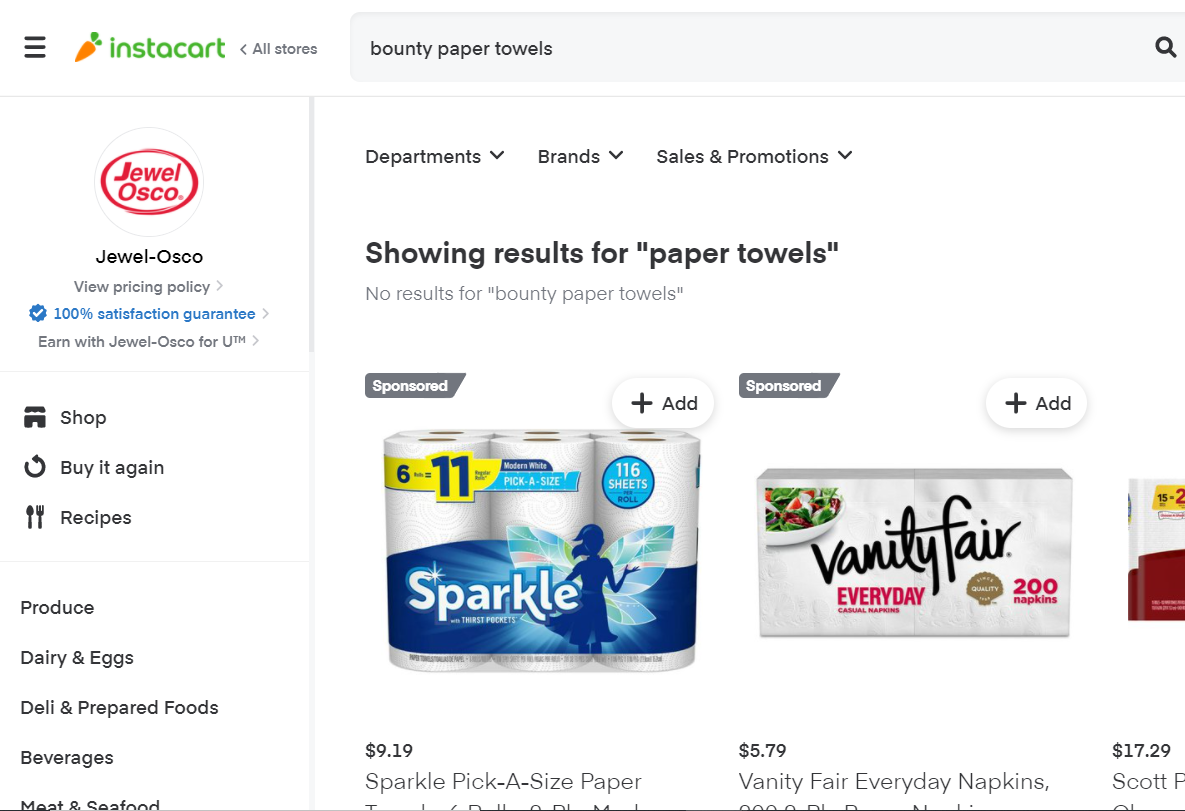
Eliminate ads and sponsored products from the first row of search results (or label as sponsored in code)
Consider simplifying site structure to allow for easier mental modelling
What I learned
-

Begin with inclusivity
Accessibility is a crucial part of that needs to be considered throughout the entire design process
-

Listen, ask, repeat
Some users with visual impairments gave specific recommendations that we didn't expect as sighted individuals. More often than not, people love to share their experience.
-

Prepare for plot twists
Allot plenty of time and resources for participant recruitment. Repeated pilot testing is your best friend.


