Case Study, 2021
IndyHumane
-
What is IndyHumane?
Indy Humane is the local humane animal shelter based in Indianapolis, Indiana. As a humane society, the organization’s mission is to house various animals that need a new home through an adoption process. They also provide clinic services such as vaccinations and spay or neuter of pets. Additionally, since they are a non-profit organization, they need volunteers to help them with various tasks.
-
Why choose IndyHumane?
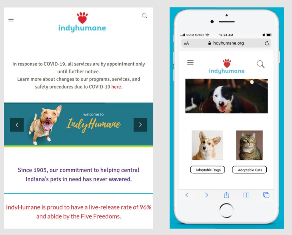
Our goal for this project is to redesign the Indyhumane mobile website to make completing tasks easier and more accessible. We think this can be achieved through proper organization of their large amount of content.
-
The Team
Shelby Rhodes | Elmar Von Brian Reyes | Ajith Gelli
All collaborators with research and test moderating as master's candidates at DePaul University, Chicago, IL -
My Roles & Responsibilities
Made a content inventory to review site information and establish scope of project
Developed a user persona to understand motivations of site usage and user priorities
Recruited participants for user testing
Conducted two rounds of remote card sorting to make informed decisions when labeling site content
Conducted two rounds of remote IA testing to make informed decisions when organizing site content
Created a task-based first click usability test to observe user decisions when interacting with site
Identified themes from research and gathered design implications
Problem & Process
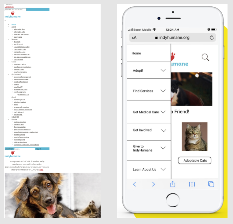
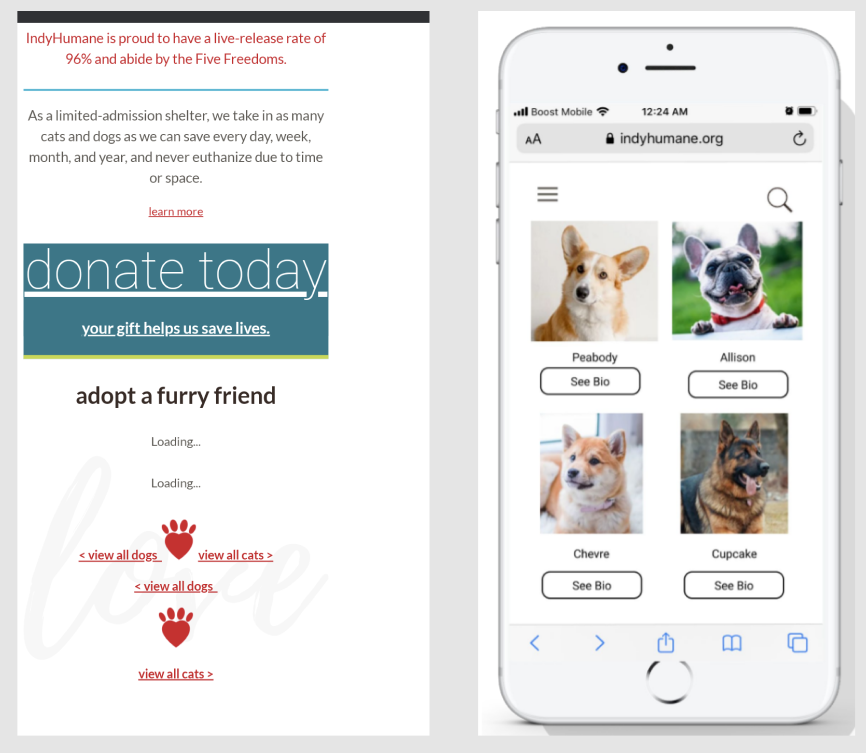
The IndyHumane Society mobile site was a "one-stop shop", overpacked with important information. Could this information be organized so new users can find what they are looking for easily?
-

Understand
What content should we focus on? Who uses IndyHumane? What IndyHumane.com features do customers use the most?
-

Ideate & Validate
How did we gather data? What were our big takeaways from our multiple rounds of testing? What did our participants share with us?
-

What We Found
What themes did our testing unveil?
-

What it Means
What changes will benefit customers? What did we learn as UX researchers and designers?

Understand
We conducted a content inventory to establish our project scope and developed a persona to understand user priorities.
Content Inventory Goals:
Understand the current navigation of the site
Figure out our scope: the top-level and second-level navigation (there was only one third-level navigation page)
We observed that some navigation links:
Could be consolidated
Were incorrectly organized
Were difficult to understand and associate
Padma and Charlie, united at last!
Padma Bhandari
A dog lover whose dream is to adopt a dog one day. She just moved to Indianapolis and works as a Software Engineer with plenty of opportunities to work from home.
Her Goals
● To adopt a dog from the local humane society and name it Charlie
● To make sure Charlie is fully vaccinated and all medical needs can be met
Her Frustrations
● Finding the perfect place with good values to adopt a pet
● Worrying if she can really take good care of a dog
● Not knowing where to go if Charlie is unwell i.e. finding a clinic
Ideate & Validate
Our team conducted multiple rounds of card sorting & IA testing to prepare for our design. We conducted first-click testing with low fidelity wireframes.
Card Sorting
We updated the cards and categories based on the results.
In the first round, our team reduced the navigation links from 40 to 38 and decided on 6 categories
After the second hybrid round, we ended up renaming 14 out of 38 cards
For the third closed round, we had users sort 35 cards into categories.
Findings from these 2 rounds led to proposed sitemap (sorted cards into the categories based on where users placed them the most )
Proposed Sitemap
Information Architecture (IA) Testing
We conducted two rounds of IA testing to test our sitemap
In each round, we had 4 tasks that covered the following objectives:
Finding a pet to adopt
Applying to be a volunteer
Using medical resources
How to Surrender a Pet
For the second round, 3 tasks had at least 89% finding success rates, 1 had a 78% success rate. In the post-interview, we found that lack of user attention affected this score
Informed our initial sketches for our low fidelity mobile wireframes
Next Steps: Design
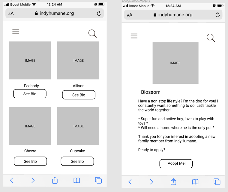
Our team developed a study to evaluate two common IndyHumane tasks.
-
1. Adopting a Pet

-
2. Becoming a Volunteer

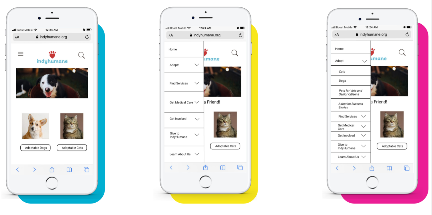
Next, we developed mobile wireframes for testing.
-
1
Preliminary Sketches

-
2
Lo-Fi Wireframes
-
3
Mid-Fi Wireframes (end product)
What We Found
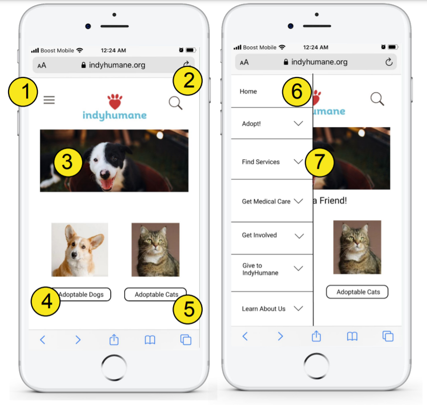
First-click testing identified suggestions for our final design.
Design Implication: Further testing could be done to see if more users choose the hamburger menu to navigate to the adoption application
1. Keep the hamburger dropdown navigation menu for the IndyHumane website
Design Implication: Minimizing extra text will help users with scanning and selection without confusion
2. Search feature icon for the IndyHumane website
Design Implication: Clear and concise clickable buttons help users accurately choose decisions
3. Main homepage and banner for the IndyHumane website
4. Clickable button to access the list of adoptable dogs at IndyHumane
5. Clickable button to access the list of adoptable cats at IndyHumane
6. When clicked, the hamburger menu expands vertically to show the homepage navigation bar.
7. Clickable navigation carats will expand the menu further for stacked items
What It Means
New possibilities for IndyHumane's mobile interface.
What I learned
Break it down
Use concise language when writing tasks to minimize user confusion
Think outside the box
Get acquainted with more remote tools for collaboration and working together for optimal communication
“Test” your tests
Prioritize additional pilot testing for things like test task speed


