Accessibility Review, 2021
Lemonade Insurance
-
What is Lemonade Insurance?
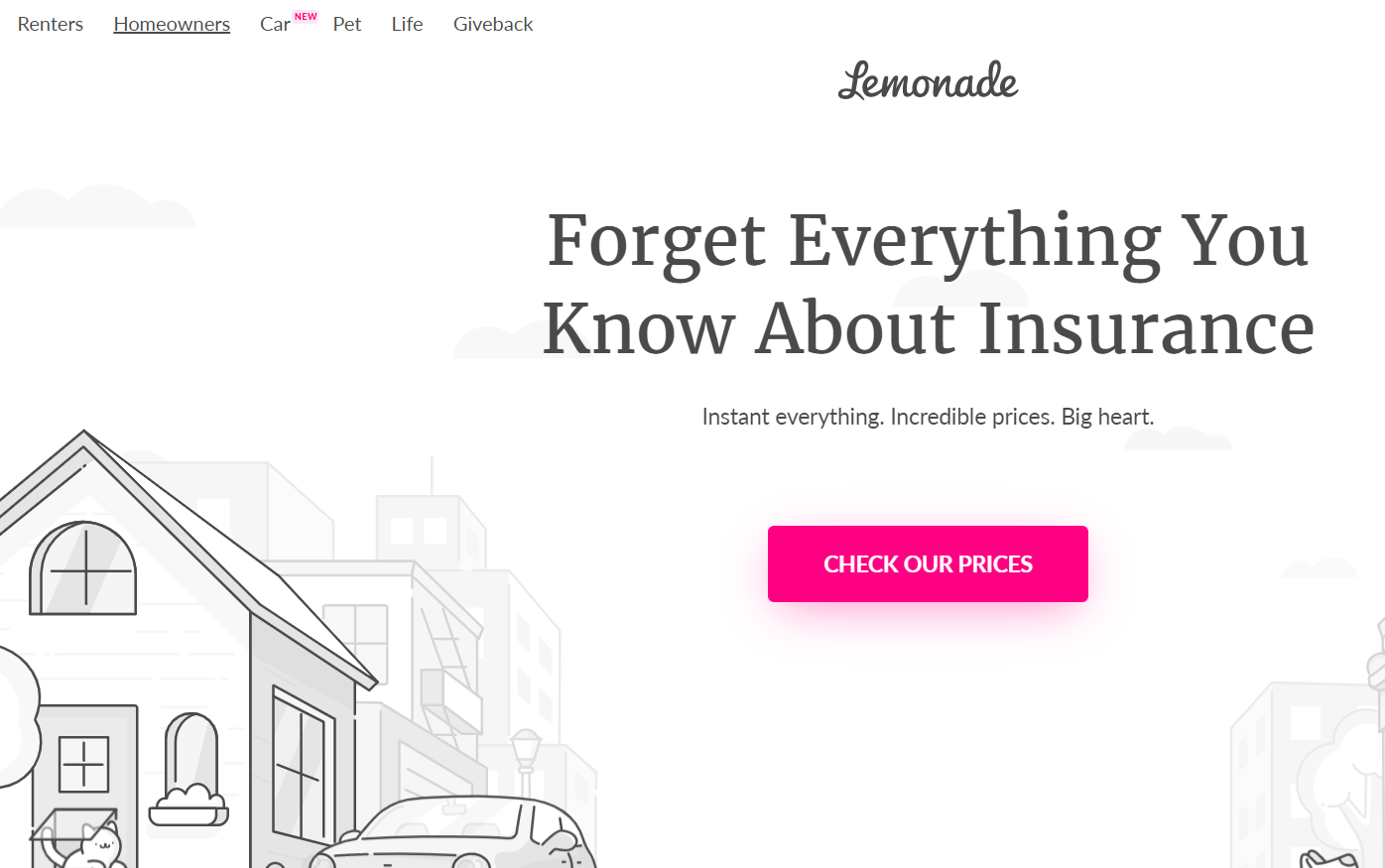
Lemonade.com is a certified B-corporation insurance company. Its coverage spans homeowner, rent, pet, life, and car insurance. Lemonade charges a flat fee to all consumers, offers comprehensive explanations of coverage, and claims to pay claims quickly, giving surplus funds to non-profit organizations.
-
Why Lemonade?
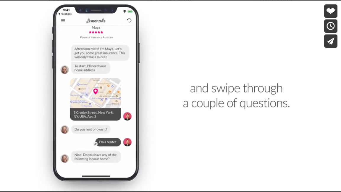
The Lemonade Insurance website has a lot of graphics and AI interactions, making this website challenging to navigate with a screen reader. For this report, I focused on evaluating the accessibility of two website pages that I felt would be frequently used.
-
My Role
Sole researcher and writer (as a master's candidate at DePaul University, Chicago, IL)
-
My Research Objectives
Use CSS and HTML validators to check for parsing errors in the source code
Run automatic WAVE and ANDI accessibility evaluators
Review ARIA capabilities
Navigate website via screenreader to identify any usability difficulties
Compile identified obstacles into the WCAG 2.0 checklist
Provide accessibility recommendations for the Lemonade Insurance website
-
Problem & Project Scope
What am I observing and testing? Which pages would benefit from a review?
-
My Tools
What systems did I use to find accessibility issues?

-
Findings: POUR Checklist
What are the key takeaways?
-
Next Steps
What changes can help Lemonade Insurance impact a larger consumer base? What did I learn as UX researcher?


Problem & Project Scope
The Lemonade Insurance website is packed with graphics & automated interactions. Is it meeting the standards for accessibility?
My objectives were to review two web pages for errors and viewability. Additionally, I checked if overall content could be accessed using a screen reader.
-
Lemonade.com homepage
The most frequently visited page, a jumping off point for any user interactions on other pages. It also has a help form that users should be able to access.

-
Renter's insurance subpage
A page users can visit to begin the application process and learn more about Lemonade’s renters insurance.


My Tools
Accessibility is a part of good, usable design. I reviewed the Lemonade Insurance website using six manual and automatic tests.

Findings: POUR Checklist
(Acronym for the principles that describe functional accessibility)
Upon review, these web pages contained errors like empty or mislabeled image tags,
inaccessible forms, and videos with no subtitles or transcripts.
Perceivable
Guideline 1.1 Text Alternatives
On the homepage, there were images with missing alternative text and empty links. The homepage had 21 instances of redundant alternative text. Additionally, the homepage had a link to a PDF document, and a no script element.
On the renter’s insurance subpage, there was an image with an empty link. The subpage had 25 instances of redundant alternative text, one orphaned form label detected, and one redundant link. The renter’s insurance subpage also had a no script element.
Guideline 1.3.2 Meaningful Sequence
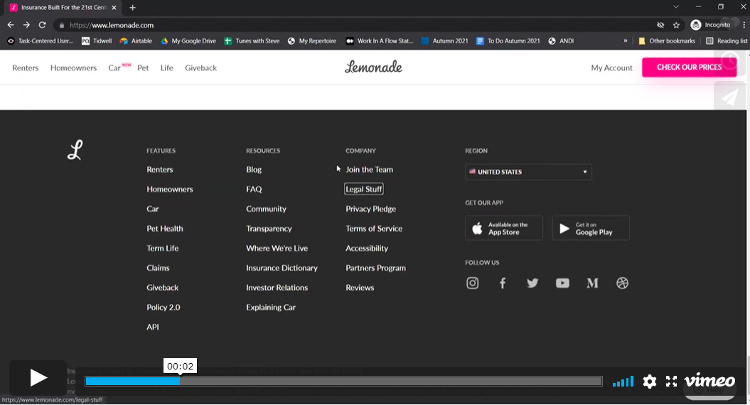
The top left main navigation menu and web page is tracked from left to right. The footer menu tracks from top to bottom, row by row until it reaches the social media icons.
Guideline 1.2.2 Captions & 1.2.3 Audio Description or Media Alternative
The video on the Lemonade.com homepage also did not provide a transcript or audio description of the video.
Operable
Guideline 2.1 Keyboard Accessible, Guideline 2.4 Navigable
Keyboard tab navigation skipped over most headings, subheadings, and paragraph text. Users that utilize assistive technologies cannot learn about the company, they can only press on buttons that take them to the AI bot application process.
Understandable
Guideline 3.1.5 Reading Level
Readable gave this site an overall grade of “A”, a score of B or above suggests the text is meant for the general public.
Guideline 1.4.3 Contrast (Minimum)
There is a color contrast below 4.5:1 between the buttons and button text.
Guideline 4.1.2 Name, Role, Value
The help form found in the bottom right corner of the homepage had no ARIA labels and was not accessible at all using the screen reader.
Robust | Screen Reader
Guideline 4.1.1 Parsing
The HTML validator flagged 57 parsing errors and 1 warning for the home page. The HTML validator flagged 165 parsing errors on the lemonade.com/renters page. The CSS Validator found 13 errors.
Screen Reader
Did not process images on either webpage, and the alt-text for the images was redundant or not available. When using the tab feature, the screen readers skipped over many informational items.

Next Steps
How can Lemonade Insurance impact more users?
Accessible design: recommendations
-
Add heading and paragraph tags to html to ensure that text registers when a screen reader is used.
Correct all other HTML parsing errors on both webpages, including CSS parsing errors.
Update alternative text for images to eliminate redundant or blank alternative text for images.
Ensure that the help input form is functional for users by having proper ARIA labels.
Remove any empty image link tags.
-
Provide synchronized or closed captioning and a transcript or audio description for the informational video on the homepage.
Make any PDF links accessible to screen readers or other assistive technologies.
-
Update the footer navigation menu to have it move in one direction.
Update color contrast throughout website to ensure that text is easy to read.
What I learned
Not all tools are created equal
For example, the ANDI and WAVE gathered different information for my research, all valuable.
Little things add up
For example, small visual discrepancies in text and background contrast led to readability issues.
Remain curious & thorough
Established companies can also overlook important design practices.


